

Quick Look: Formosa Tea
First Look at What’s Inside the box

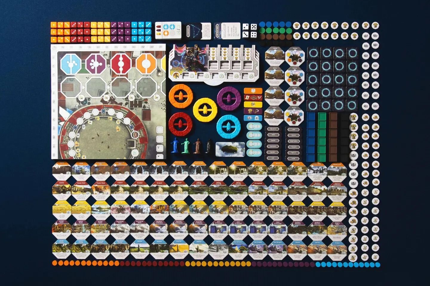
Component Close Up
Back in 2019 (boy that feels like ages ago) I saw snippets of Formosa Tea. From the playthrough and teach of Heavy Cardboard’s YouTube channel, to the very few marketing pictures of the game on BGG, the game spoke to me. The green tones and muted browns of the box cover, watercolors that blended together so effortlessly, to the bright greens, oranges and blues of its wooden components, the palette presented was visual eye candy to me. Call me superficial, but in this instance, how this game looked made me take notice.
I finally got my copy from Miniature Market, after so many failed attempts to buy one from different stores. So, upon the first opening of the box, what do I think of the component quality?
Let’s find out.
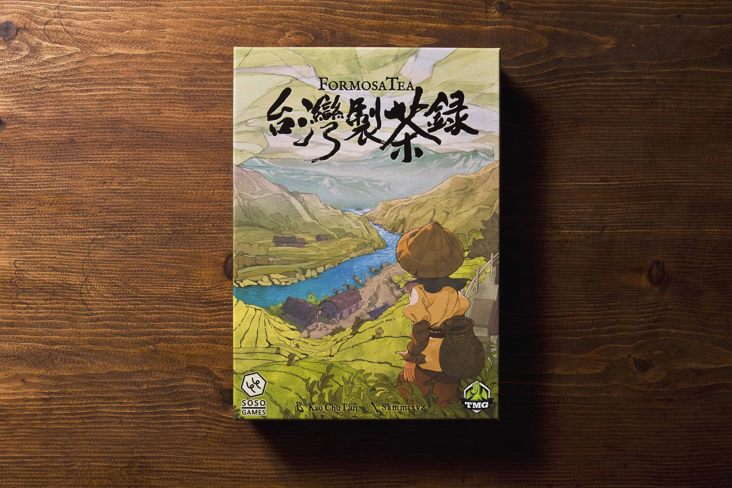
Box Art
Upon first picking up the box, one thing is clear, this is a physically dense game. The box itself isn’t monstrously huge; opening the box shows a dedicated purpose to every square inch provided. I appreciate this immensely. I’m tired of publishers and design studios sticking their games into overly spacious boxes that could house the game twice over.
Not so here. Everything fits nicely and the box would slide comfortably in a shelf without displacing other games around it. The box finishing is matte, linen textured. It feels great in the hands. So too is the art work. If that mountainous, lush with greenery and striking blue river that runs through the landscape doesn’t do it for you? I mean…regardless, I’m a fan of it and it’s what drew me to the game in the first place. The colors, typography and setting completely won me over, so I guess I’m a sucker for pretty artwork.
So shall we see what’s inside?
Components

Components
Oh my! That does look stirring, doesn’t it? I’m happy to say that the artistic quality from the outside translates very well to the components within. On top of that the physical component quality is top notch. Let’s start with the boards, both player and main board. The cardstock is nice and thick, sturdy, colorful, full of designed purpose. Nothing here will bend, at least I should think so, as these boards are satisfyingly hefty stock. I’ve seen some paper thin player boards before that bow and flex too easily. These will not, and I’m confident to say that.
The wooden bits and pieces are nicely sized and tactile. They are also light, almost airy. I’m totally okay with their weight. They are also colored differently from the other components, the cubes that represent the different types of teas. I like that whatever is represented as tea manufacturing has an earthy palette, while workers and markers are a stark opposite—blues, blacks, whites and grays. There is a clear distinction, but it will make everything readable and easy to view at a glance.
Speaking of looking at a glance…
Artwork and Graphic Design

Board Close-Up
As stated above, the art style is very much present both inside and outside. Its symbiosis well executed. You can clearly see its bits and pieces, the guts, match the skin outside. Looking at good art direction and care to style in all aspects of a production makes other games that don’t do it stand out like bitter tea. The watercolor aesthetic on the card backs and weather markers, the tonal consistencies of the game boards, makes everything stand out. I think it will have a nice table presence once I get it playing on the table.
Also, it’s nice to have a theme that itself is rare to see in Euro-styled games. After so many games sticking to the pragmatic aesthetic of European colonialism and medieval-times, a game bringing us Taiwanese tea production at the turn of the 19th century is refreshing. It helps that Soso Studio is based out of Taiwan, and I hope more studios coming from different regions of the world manage to bring their games over, just so we have different environments and perspectives that are told through the words and minds of those that live within those themes.
Overall, I’m really happy that I finally have Formosa Tea in my hands. It’s a game I’ve been looking forward to for a while and now I must sit down and learn its intricacies to see how good the gameplay is. For now, initial impressions of its components and art give me hope that its gameplay translates just as well.


